Wednesday, 6 May 2015

Toile 2.0 and Print

[Developed stand work]

[Samples in stand work]


[Prints]

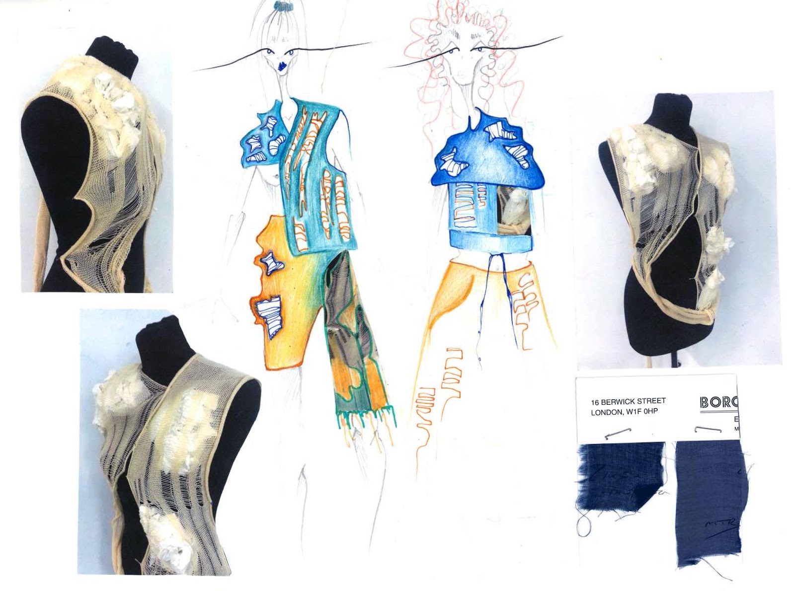
After playing around with a few different sleeves, and slowing adding on bits to the front of the jacket I finally came up with this shape. I am pretty pleased with how it turned out and the samples fitted well into it. As said previously, I am especially happy with the asymmetrical sleeve, and I feel the lumpy front of the jacket being on the other side balances it out well. I only made the front of this garment because I am undecided on how I want the back to be yet, so after a few more drawings I will go back to the stand and add it in.

After making this toile, I decided that instead of having it cropped as seen in the post before, I am going to incorporate it into a whole outfit. Having a cropped top underneath with perhaps a pair of trousers or culottes. As the layers are removed the more normal everyday outfit will be seen, a metaphor for my concept. However someone may look on the outside, underneath we are all the same. Designing this 'baby' included both the idea of a perfect structured look with irregular and abstract shapes that represented the silhouettes I created from my visits to the Hunterian Museum and the Tate, Time Conflict Exhibition. 

As my tutor Dan mentioned, some digital prints would bring it out to the next level. As I really liked how my earlier watercolour development of Cyril Caine's photography turned out, I decided to work with this. Unfortunately, I had painting in shades of yellow and green so I couldn't use the image straight. However, this was easily reformed by simply scanning it in and playing around with the hue and saturation on photoshop. I produced quite a lot of different versions but the four seen above were my favourites. I feel the zoomed in versions give a better idea for how I want them to be seen, as something beautiful not necessarily a physical deformity, but I decided to have two full to see how they compare after printing. I am going to get these prints done tomorrow as I was too disorganised to do them today and I forgot to sign up meaning there wasn't time for me to print. Something I felt I have really improved on within this project is my time management, even though I couldn't print them today I had sorted out all my fabrics for sampling and was ready to go tomorrow. 


Tuesday, 5 May 2015

Paper Toiling

[Stand work]


Starting with a basic bodice block shape, I started to add on shape, sleeves and collars to work out how the drawings and designs I've been doing could translate into a garment. Before starting the paper toiling process, I visited the library to photocopy a few pattern cutting books, my knowledge of pattern cutting is basically zero and apart from the first project, I have never created a pattern before. Going through the resources at the library was actually extremely helpful, I found a collection of books called 'Pattern Magic' which are Japanese, and they give step by step breakdowns of conceptual silhouettes and detailing. As most of my designs have been conceptual I thought it would be impossible to construct many of them through an actual pattern, but after reading the whole series I have come across a few various processes and techniques to achieve what I hope it to look like. 

As seen in the first set of stand work above, I used a pretty basic bodice and sleeve block. Instead of measuring, I did this through trial and error, cutting away too large pieces of paper and pinning on extra pieces where needed. Looking back on this process, I should have perhaps asked for help with this as it was quite time consuming but I also felt proud that I did it alone. Using my earlier stand work construction on top, I recreated the pregnancy bump. I was really unhappy with this stand work as I think not only is quite dull, but also it has no development from my earlier work. So scrapping this I started again.

[Stand work]

I wasn't sure if I wanted it to be cropped or not so I made up both on either side of the mannequin so I  could measure them against each other. Although I only made one sleeve for the toile I actually like it a-symmetrical and will leave it like that. Over this week I will develop and refine this until I am happy, and after transfer it to calico for a fitting.  

As well as this I created my final knit piece, which was just a much longer larger version of my earlier hand dyed sample. From experimenting with this on the stand I put the images into my book and collaged them into designs, collaborating my stand work designs with my knit ideas.


Thursday, 30 April 2015

Knit Forming

[Pages from sketchbook]

As development to the YouTube videos on Chernobyl, and to the images of the smoke clouds I saw in the Tate, Time- Conflict exhibition, I decided to continue my 'pillow' work, but also translate this into a textile that could be used within a garment, knit. I wanted to work with more textures within this project, even though it is much more time consuming, this experimental approach makes the work much more exciting and individual. Creating silhouettes this way is much more interesting than working with paper as it gives more to work with and the heaviness adds a new dimension to the stand work. After my earlier attempts at hand knitting, I decided to go back to the knit machine. Although I enjoying the challenge of teaching myself to knit, It was an extremely slow process and I could only do the basic knit which wasn't what I wanted. Creating samples with different materials and techniques helped me actualise my ideas, and realise what would work for me and what wouldn't. 

Using this sample I started to draw where it could be placed if in a larger sample, something I will do onto the mannequin at a later point. I felt it worked best as a cut out piece or around the neck and shoulders, created an uneven shape or an accent. After this point I felt a little deflated as I was started to lose interest. To bring my focus back I moved onto the pillow designing and started collaging and playing with silhouettes of the cushions, including accents of colour and pattern.  I think the shape of garment I aim to create is pretty defined already, I love the oversized arm shapes and wide kimono style coat jackets. As it's such a simple pattern, it's simple enough to alter. The great thing about using a duvet or pillow was how easy it was to manipulate, through dying or painting a duvet in my chosen colour palette I could create a whole garment simply through draping and pinning until achieving what I want it to look like. 

I am unsure at this point how many final garments I want to achieve, this will probably be determined by timing. I would ideally like to produce 3; a coat/jacket, trousers and an over coat. Perhaps an accessory too, to fit within my current work I think this would be made from knit. I want to experiment sewing the knit across stretches of calico or simple white fabric so that it can be easily stuffed. Although the cabbage dying was technically 'unsuccessful' I have actually really grown to like the colour and have decided to add it to my palette. 

I feel like I am spending a lot of time on sampling and need to push it further to designing quicker, I am still a little behind on schedule but hopefully will catch up this coming week. Making larger samples means I can experiment with them on a mannequin, using each sample through photocopying and collaging my illustrations will help me move on providing texture ideas later on in my design process. 


Wednesday, 29 April 2015

Mid Point Review

[Mid point review sheet with Tutor Dan]

My mid-point assessment was pretty useful in helping me realise where I was in my project and also to bounce a few idea's off Dan to progress with. Receiving critical feedback on my work so far, especially with a grade was a good guide for how to develop the project in a way that would help me achieve the highest mark I can.A Dan gave a mixed review, and although he feels I can achieve a Distinction I am not there yet, I felt this was a very fair review. My development was still at early stages and I felt I needed to speed that up to get to the level I wanted to be. Dan suggested adding in more textiles, like digital printing. This was something I was aiming to do anyway but we worked out a few ideas to print, using my past research work scanned in and edited. 

To move from a merit to distinction, my designs need o move from initial stage to further sampling and further designs. I need to keep going in between stand work and designing, this is a process I've been trying to do through this project as I want the final stand work to be thought through and complex. My main aim was to include more fabrication, and personally although Dan said I need more, I felt I have included a lot more than I have in previous projects. My thought process on fabrics and the construction has really improved and I think I have explored fabrics and materials that are much more experimental too. I need to experiment more outside my book, especially with different and new fabrics on the stand.

After my Mid point, I asked Becca to also go through my blog and book. This was to give me more than one opinion, and also to give me a chance to question her about the ideas Dan and I discussed to see a new perspective on them. Similar criticisms came out, I need to work quicker and my designs need further developing. What really helped was the two perspectives on my blog, Dan was happier with my blog than Becca, but this meant I got more pointers in how to really improve it; Much more analyzing and reviewing. Also to bring back in my research whenever I have development that related to it, for example in a blog post on stand work that was developed from my interview with Cyril Caine to mention this and explain its relevance. 


Stand Response


[Stand response]

Collectively going through my previous stand work and illustrations, I continued to draw and bring in the colour. Through working out the balance of orange and blue against the white, I could refine the illustrations. Adding in fabric swatches and samples helped me draw as I could match the style of garment to the fabrics, allowing the more flowing fabrics with looser shapes, and the more structured fabrics with the more structured designs. Working on top of the stand work in pen, adding in shapes and colouring parts helped me think more about individual shapes as opposed to the stand work as a whole. Through picking out these individual shapes I could apply them into later illustrations, making my stand work produce twice the amount of designs it might have otherwise. This method of experimentation is pretty useful, and I am pleased with how the illustrations are turning out. As I am no longer focusing on the 'body' of the illustrations it has allowed me to really branch out with who I draw each item, making each illustration bigger also meant I could bring in a lot more detailing. 

As I am designing for A/W the main focus will be 'outerwear' so coats, trousers, jackets etc. Bringing knit into this helps the transition from light outerwear to winter. Keeping the colours bright however keeps it in season, but makes it stand out from perhaps other autumn winter wear. The layering of fabrics well also help produce a garment suitable for A/W, however I do not want to have an extremely heavy garment. Although I have been fabric shopping and sampling all this and last week, I think something like neoprene will actually suit the style of clothing I hope to produce. I like clothes with structure and although I want it to be 'lumpy' the basic shape would be best to create something that holds its form. Also neoprene comes in really bright colours, matching my colour palette and would overcomplicate it with pattern. As can be seen in some of the sampling above, the mesh and knit mixes are something I will continue to expand and experiment with. I am still focused on this idea of creating abstract shapes and lumps within the garment, so in my next stage of stand work I will aim to include a few samples and examples of what could work.

Over the next week I aim to finalise my ideas and produce a set of front back and side designs so when the woman coming in to help with pattern cutting comes in, I will have a good idea for what to draw up on pattern paper. This will ensure my toile is the best it can be, and also means I will have time to alter it a few times before making the official garment. I am excited to develop these rough ideas and see what more I can come up with, especially with more complex designs. 

Tuesday, 28 April 2015

Frida Development

[Frida Kahlo research page]

After moving quite far away from my initial concept, I decided to bring back in the pregnancy and child concept. Frida Kahlo seemed the obvious choice for inspiration, and the colours she used fitted well within my colour palette. Frida was involved in a horrific car accident that left her unable to conceive which is reflected a lot in her work. Themes of pregnant women, disfigured 'wombs' and children fill her paintings. I particularly liked this painting of her with the metal pole going through, I responded to it in a 'gaping hole' where the womb would be; a lack of pregnancy. Developing this idea through textiles like knitting worked well, adding ladders and lace holes produced a sort of destroyed lace appearance.


[Stand work]

Translating this into stand work was actually quite difficult, I used my earliest research from the Tate, Time- Conflict Exhibition for shape influence, and cut out a selection of shapes and roughly sewed them together. After my development research of Frida Kahlo, I wanted to incorporate the pregnant belly, but as well as the obvious placing of the stomach I played around to see what it would look like as a sleeve, shoulder, or even collar piece. Although the results were interesting and progressed my designs into new silhouettes, I still felt that the stand work was very basic, draping helps initial designs but it wasn't realistic enough to be converted into a garment, something I hope to work towards in the weeks ahead. This combination of shapes inspired me to start combining materials, although the two colours I used were not relevant the balance of heavy 'leather' with the soft folds of the organza I really liked. Once I have more designs, and have more fabric swatches I will continue to combine and sew together materials that don't compliment each other. 

[Cabbage dying the knit]

The only knit colours that were available were of that off-white/beige which obviously wasn't part of my palette so I decided to try out a method of natural dye; red cabbage. It created the most beautiful deep blue water, but unfortunately it only dyed the wool a lilac colour. However, although not the colour I was hoping for I actually really like it, and will go on to dye my final knit sample in this method. I think through increasing the amount of red cabbage the more intense the colour may be. Through researching it, onion skins produce a burnt yellow/orange colour, however seeing samples of this I feel it might be too yellow and faint. 


Sunday, 26 April 2015

The Mutant


[Research videos]

[Personal Response]

These two videos were what begun my research in the first place, although I didn't want to 'go back' on myself as such, I wanted to ensure my development was still relevant. After focusing so much on abstract shapes, I wanted to create more of an instalment than more stand work. However, I did apply these pillow and towel shapes onto a body (my mum) to see what it would look like. It was pretty unsuccessful as the pillow was too heavy and she had to hold it instead of pinning it. I chose a pillow for the 'fluffy' appearance. The lumps and bumps appear soft and almost welcoming, playing with the juxtaposition of how subjective beauty is. To further this development, I will move to a duvet as the material mass is larger there is more leeway with how I can manipulate it. 

[Shapes on figure]